|
|
Post by Susan on Aug 14, 2010 11:10:25 GMT -5
MORNING! Dawn I just saw your comment on the blog about Copic colors. It got me to thinking that maybe colors still have people really surprised/shocked/confused. You said that you thought I had colored little Cherry Emma with primary colors, because the colors I listed were so light. The blues are actually fairly dark, especially when layered together and blended well. I wonder if it's the hair colors you were surprised by? Tell me what you thought the numbers would be. What were you expecting to see me use when you saw the colored image first? I try and make the Copic experience as understandable as possible, and as easy. I always think that just showing lots and lots of samples - and now trying my hardest to list numbers used - does that. Is there something I could do to make it easier? What else could I show or demonstrate. What kind of a class would you love to see about Copics? let me know - and let's chat about ideas or needs you all have regarding Copics!  |
|
|
|
Post by northerncrafter9 on Aug 14, 2010 12:16:18 GMT -5
Hey Susan, I was looking through all the colors available and thought the colors I would buy are the primary colors. But after seeing your last project and noticing you used colors I assumed were the deepest primary colors but were really much lighter choices I got confused with how deep the colors really were. Most of the colors I was thinking you used are in the primary colors basic set of 12 markers Dani has up for sale. like lipstick red, forest green, brown, dark brown, orange etc. There are so many color choices and I think copics colors are so rich that we can use lighter color maybe? not sure. I would love to see demo on the dark colors versus the light colors to show the contrast. Maybe also how to pick a color and colors lighter and darker to create shading and such. Since I color using mostly bright primary colors (using color pencils) I thought copics markers would be the same but I guess not becuase they can be built upon through layering.  I will post the numbers after I get them together. |
|
|
|
Post by Susan on Aug 14, 2010 13:10:46 GMT -5
I can't remember which class we went over it in - but the colors are indeed tricky to figure out. But it's almost like once it "clicks" it makes sense. First let me say that in general I am not a huge fan of sets. ESPECIALLY for initial purchases. I don't think anyone should make their first purchase a set. Even my Copic Certification instructor told me that the sets aren't really put together for beginners. Here's why - in the Basic Brights set of 12 you get: B05 R29 YR04 Y06 G07 E37 BV08 BG49 RV04 V06 and V17 none of those colors are going to work together for any kind of shading or blending. What you get is one color from each color family. Now I might buy this set - because I think I only have 2 of these colors - so they are great for "fill in" - but a beginner making an initial purchase would not really be able to do much with this set. So you could color G07 grass, but you can't make any darker green flecks or lighter highlights. You can surely color a bright blue t-shirt on a little boy, but it's going to be a solid blue. No darker edges and no lighter worn patches. Sure you could make some patches slightly darker by building up some layers...and Lord knows I do that on colors I am lacking in...but these are dark colors to begin with...G07 is kelly green - it's intense! So always always always start as light as you can. Let's take B32 - Pale Blue in the above example: B is the BROAD classification - the color family {blue, blue-green, yellow, yellow-red, earth, red, red-violet, etc.} The number portion of each marker describes the qualities of light, dark and gray in each marker. the first number, 3 is the INTERMEDIATE classification - the color hue within the family. It's how Saturated with pure pigment that marker is...how vibrant. Zeros will be vibrant, 40s will be in the middle and 90s will be deep and dull. the second number is the SPECIFIC classification tells you how light or dark the marker is within its saturation group. B01 will be light and be great for bright highlights B04 is still vibrant blue, but a middle tone on the gray scale B09 is a strong shadow that definitely matches this grouping. If you tried to stick a B49 in there for your dark shadow the color is likely to look really WONKY because it's starting off about 4 families of grey duller! I've stood in stores with people picking colors before - they'll grab B00, B35 and B97 thinking they are covering all their blue bases. But it just won't work. None of those colors will work or blend together. you really need to stay within an intermediate {first number} family when coloring! CONFUSING...but seriously once it clicks {which comes from lots of playing} it makes sense! And trust me - I am NOT A PRO - I just color a lot and you know...am opinionated!! LOL B is the color FAMILY 3 {the first number} is the color HUE |
|
|
|
Post by northerncrafter9 on Aug 14, 2010 21:29:10 GMT -5
Thank you for the information. You just explained something that I was not getting. Now I understand more about the colors and their color families. So if I am understanding correctly B(0)3 the zero is the same hue so all the B(0)# go together and say B(1)# is a different hue and so on... So if I want to blend and shade with say B03 I need colors in the same hue like B09(making up numbers here) .... Right? I think I get it....  |
|
|
|
Post by Susan on Aug 14, 2010 23:11:47 GMT -5
Thank you for the information. You just explained something that I was not getting. Now I understand more about the colors and their color families. So if I am understanding correctly B(0)3 the zero is the same hue so all the B(0)# go together and say B(1)# is a different hue and so on... So if I want to blend and shade with say B03 I need colors in the same hue like B09(making up numbers here) .... Right? I think I get it.... by george I think she's got it! {said in my best british accent!} YES - when I colored the blonde/brown hair yesterday I used E33, 35 and 37 and they work together PERFECTLY! My favorite red combo is R22, 27 and 29 {used on the cherries} Blue jeans I usually grab B93, 95 and 97! Sure there are sometimes reasons to go all wonky and throw in a different color...I do it most often with hair...but 9 times out of 10 you want to stay within the same family - 10s, 20s, 30s, 40s, etc. HOORAY!! |
|
|
|
Post by Dania on Aug 15, 2010 16:03:20 GMT -5
 Love It!
|
|
|
|
Post by Diane in NH on Aug 17, 2010 17:50:05 GMT -5
Thank you for the information. You just explained something that I was not getting. Now I understand more about the colors and their color families. So if I am understanding correctly B(0)3 the zero is the same hue so all the B(0)# go together and say B(1)# is a different hue and so on... So if I want to blend and shade with say B03 I need colors in the same hue like B09(making up numbers here) .... Right? I think I get it.... by george I think she's got it! {said in my best british accent!} YES - when I colored the blonde/brown hair yesterday I used E33, 35 and 37 and they work together PERFECTLY! My favorite red combo is R22, 27 and 29 {used on the cherries} Blue jeans I usually grab B93, 95 and 97! Sure there are sometimes reasons to go all wonky and throw in a different color...I do it most often with hair...but 9 times out of 10 you want to stay within the same family - 10s, 20s, 30s, 40s, etc. HOORAY!! This is really beginning to make sense now. I had never caught on to that either. Now I will try out some of the shading using the numbers. I'm so excited!!! I've got dozens of Ciaos that are sitting here staring at me and whispering, "Too bad you don't know how to use us. We are so nice and friendly." Or maybe that's my medicine talking . . . The one thing I do need concerning Copics, if you are in the sharing mood, Susan, is talent. I really need some talent. |
|
|
|
Post by Dania on Aug 17, 2010 20:15:17 GMT -5
This is great info. I was actually thinking today about this. Susan is there a way to compile all this info on a PDF file on your blog? Would be great go to material.
|
|
|
|
Post by Susan on Aug 17, 2010 21:05:32 GMT -5
...have i ever mentioned that i need a secretary!
LOL
|
|
|
|
Post by Susan on Aug 17, 2010 21:06:32 GMT -5
...have i ever mentioned that i need a secretary! LOL OH and a cook! I really need a cook! and a driver wouldn't hurt either...wouldn't that be sweet, with a Lincoln Town Car sitting at the ready...wonder if TCs come in lime green... hmmmmm................. |
|
|
|
Post by Dania on Aug 17, 2010 22:32:05 GMT -5
I know - I hesitated in posting that. But it is really good information and I wish I would have had it before going on a copic binge. AND I still don't have all the colors that work together AND now my C1 has dried up, so I'm already needing refills.  AND I know I could have asked you BUT I didn't even know what to ask.  |
|
|
|
Post by Basketlady on Aug 17, 2010 22:47:58 GMT -5
If I ever win the lottery, I am so getting that driver and Town Car. Then he can drive me to Bloomies and Nordstoms where all the great shoes hang out together!
Michelle
|
|
|
|
Post by Susan on Aug 17, 2010 23:07:57 GMT -5
I know - I hesitated in posting that. But it is really good information and I wish I would have had it before going on a copic binge. AND I still don't have all the colors that work together AND now my C1 has dried up, so I'm already needing refills. AND I know I could have asked you BUT I didn't even know what to ask. in one of my very early Copic videos I talked about colors and numbers - I remember I wrote out the number and explained what it meant... gosh that seems like eons ago. don't think of them as mistakes though - more like "future expanding"...LOL!!  |
|
|
|
Post by Dania on Aug 18, 2010 7:28:47 GMT -5
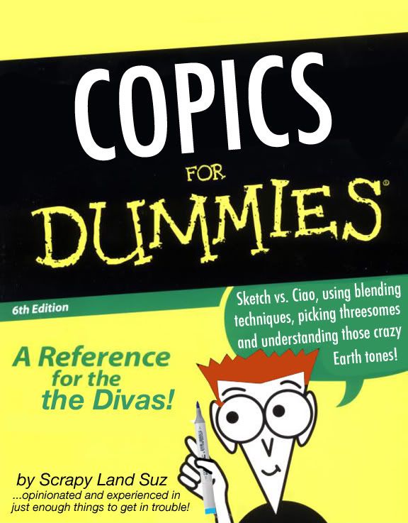
I know - I hesitated in posting that. But it is really good information and I wish I would have had it before going on a copic binge. AND I still don't have all the colors that work together AND now my C1 has dried up, so I'm already needing refills. AND I know I could have asked you BUT I didn't even know what to ask. in one of my very early Copic videos I talked about colors and numbers - I remember I wrote out the number and explained what it meant... gosh that seems like eons ago. don't think of them as mistakes though - more like "future expanding"...LOL!! Yes, I do remember that video but somehow I ddn't quite grasp it then.  It wasn't until I printed out the color wheel and studied it that I saw what you were talking about. I highly recommend this for visual learners. Susan you need to write a book - Copics for Dummies. Honestly, the earthtones are the ones that confuse me the most. |
|
|
|
Post by Susan on Aug 18, 2010 9:03:53 GMT -5
|
|
|
|
Post by AnnaMatrix on Aug 18, 2010 9:04:46 GMT -5
Thanks, Susan! Now I know why some of my shading attempts look wonky (I think "wonky" is the word of the week! ;D). Since Dani just got a big Copic order in, I just placed a pretty big order - filling in the missing shades to avoid wonkiness! Hopefully, with the right colors, my Copic skills will improve (if not, then it must be operator error ) Gail |
|
|
|
Post by Susan on Aug 18, 2010 9:08:28 GMT -5
oh Gail - a new shipment of Copics - HOORAY! And trust me - no part of your skills would I label as operator error - you have awesome Copic talents. It bears repeating - the best way to improve is to just color, color and then color some more! It works, you learn, you discover, you get better! That's why I try and color a little bit each and every day! Right now I'm experimenting with darker skin tones...it's tricky, but each attempt I make I feel like I improve. {Isn't it fun having something that we "have to do"...LOL!!!!} |
|
|
|
Post by Karen W on Aug 18, 2010 9:25:12 GMT -5
I find coloring so relaxing.
Like Susan has done on LIVE show, I do a color line on scrap paper so I can see the color next to the color I am shading with. This way I have an idea of what it will look like before I actually put the color on my image.
I also write the color next to the color line so I have a reminder/record of what I used. I was finding that I would do a hair color that I like, but forgot what color I use, so now I keep a list.
I do like Susan's way of stamping several images and then coloring hair or skin and recording the colors next to the images and keeping that for reference..
Susan - they say the cover is the hardest to design when doing a book!
Karen
|
|
|
|
Post by Basketlady on Aug 18, 2010 19:22:06 GMT -5
My Copic coloring um, stinks. But I love the book cover!
My biggest regret in college is that I didn't take a drawing class, but took art history. Ok, I know tons about art (that I've mostly forgotten!), but I still can't draw. Now that's a life skill that I needed!
Michelle
|
|


 It wasn't until I printed out the color wheel and studied it that I saw what you were talking about. I highly recommend this for visual learners.